Pop Art, Kidsevent & Artsy Work
By Malika Sadvakassova Branding and Marketing Master’s Coursework Final Year Project 2019/2020
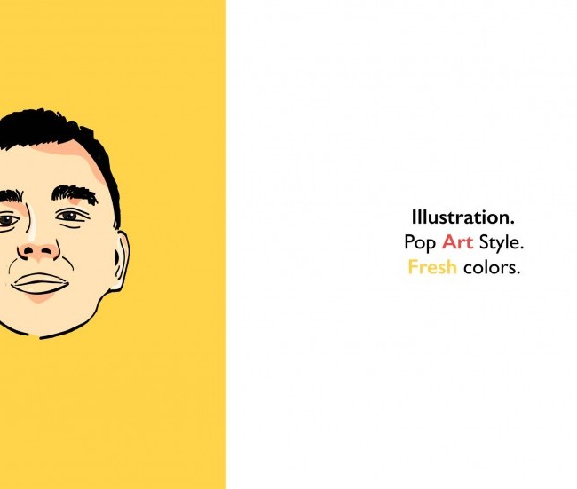
The following illustration was my first attempt at pop art illustration. I chose an intense yellow background to grab attention. The face is that of a friend that I tried to illustrate it in pop art style. I find this style aesthetically pleasing and modern.
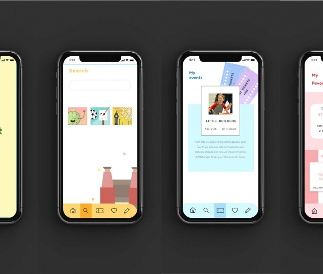
The following work displays sample screens of an app I have created. It is called Kidsevent and is focused on helping people easily find different events for kids and teenagers that will help develop their social, personal and cognitive skills, as well as widen their world view.
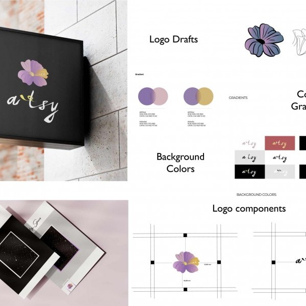
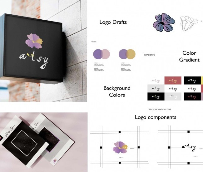
Artsy is a brand that I have created as a future art and design agency. The idea was to build my own company, and I therefore created a logo for it. The flower image is taken from a tattoo I have. I decided to name the brand “Artsy” as I feel this word to be very creative and appropriate for an art and design agency. The letter ‘M’ on the flower represents my name, Malika. For the logo, I chose gradient colours as I feel they look modern, and in a 3D format, they make the logo look attractive.


